The Survey Academy Series: 7th Chapter
The design – meaning the type of questions and how they are presented – that we choose for a survey is essential. A good survey design is the one that prioritizes the respondents, as opposed to a design that facilitates the researchers’ or the surveys programmers’ work. Therefore, a good design is the one that facilitates and helps respondents to complete the survey.
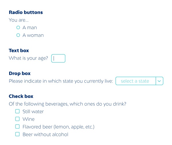
There are many elements that have to be taken into account when designing an online survey. One of these key elements is the choosing of the scale type which is going to be used in each question: radio-button, check-boxes, drop–boxes (also known as drop-down list), text boxes, etc.
Figure 1: different types of scales
Drop-box scales are probably the scale type used least effectively by researchers and survey programmers. The main problem of this type of scale is that it provides advantages to the researchers (takes up less space on the screen), but at the expense of creating disadvantages for the respondents (options are not visible at first sight and you need to use the mouse to scroll-down and see all the options). In those cases, it's just bad survey design.
Drop-box scales can usually be replaced by radio-button scales, which allow respondents to see all the options thoroughly without effort and, therefore, easily complete the survey. Moreover, these radio-button type questions are very common on the Internet, which means respondents know how to answer them.
However, in some specific cases the use of drop-box type scales is justified:
- When there is a very long list of options which cannot be shown fully in the screen of the navigation device.
- When respondents are really sure of their answers, and therefore, at the time of deploying the drop-box, they search straight away the specific option without deliberation.
The country of origin and the nationality are typical questions in which a drop-box can work correctly. In these cases, a radio-button type scale cannot be fully shown in the screen. That is why it is preferable to use drop-box rather than text-type scales, as respondents know in advance what they are going to respond. We can avoid making respondents type their answer, which will prevent misspellings and the need to recodify afterwards.
There are different ways to present drop-box scales, and if a researcher decides to use them, it is important that he/she uses them in the appropriate way. One of the main decisions that has to be made is whether answer options are going to be shown in the beginning or not.
Figure 2: How to present a drop-box scale
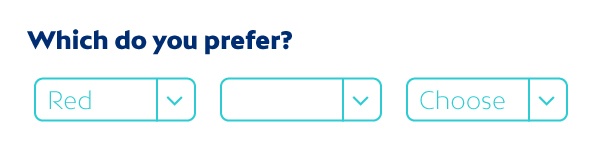
If there is an option pre-selected, the question seems to have already been answered. However, if no option is shown, respondents will find it more difficult to know what to do in order to give their answers. The goal of the question is that respondents choose a specific option in order to count it as an answer. The probability that the respondent choose the one already shown instead of the rest of options is higher (primacy effect). For these reasons, it seems preferable to place instructions into the drop-box, for example “Choose”. This facilitates the understanding of the respondent about what task we want him/her to do, without inducing bias in the response.
In summary, drop-box type scales should only be used in very specific cases. In general, a radio-button type scale is usually recommended. In specific cases where it makes sense to use a drop-box scale, any available option should not be shown straight away in order to avoid this option to be chosen more than usual. Instead, an instruction should be shown so that respondents understand what they have to do (for instance “choose one” or “select one option”).